Arvo: Characteristics, Personality, Rhythm & Flow
Project 3: Type Face

Part One Overview:
September 26, 2020
–––––
Make a list of adjectives that describe your typeface (Arvo). Then, write a one to two page essay that highlights the unique characteristics and personality of the typeface, and a brief statement (50–65 words) that encapsulates the content of the essay.
Elements to consider:
- Name of the typeface and the family
- Name of the designer(s), country of origin, and date of design
- Type classification, expressive qualities, personality
- Description of the visual characteristics of the family
- List or description of the various weights, slants of the entire family
Exploration:
September 27, 2020
–––––
Before starting the essay and the brief statement, I wanted to learn more about the font and its visual qualities. I used colored pencil on paper to physically feel and visually see the various weights. Are there any repeating patterns? How is the x-height, the descender, the cap height, kerning treated in the font family? Does the rule change for italics?
Weight and Kerning (bold):
How can the letters be gridded? Is there a relationship with the kerning and the letterforms?

The kerning changes depending on the letterform on the page. The width of the slab-serif and the stroke is equal, except for rounded forms, where the stroke has been thinned to accommodate for the illusion of being more “thick”
Angle of the Italics (regular, italics, bold, bold italics):
How are the italics different? Does it use the same slab-serif? What are its angles?

The angle of the italics are the same regardless of its weight. The slab-serif and the letterform widths are the same with its respective non-italicized type.
Weight and Kerning (regular, italics, bold, bold italics):
How does the kerning, and the slab-serif vary between the different font families?

With italicized types, there are instances where the kerning is close to “0” or even a “negative” value due to the use of slab serifs and better legibility.
Kerning and Low caps (italics, bold, bold italics):
How does the kerning change in low caps? in italics?

Usually, the kerning is lower for italicized text. A common pattern I discovered was that when next to a round letterform, the kerning is usually a very low value in order to accommodate for the illusion that its “further” when it isn’t.
X-height, Descender and Kerning (regular, italics, bold, bold italics):
What is the relationship between the descender and the x-height? How far does it go?

As you can see above, the letter “f” has a descender for italicized text, most likely to evoke a sense of movement and create visual interest. I noticed that the height of the descender is approximately half the height of the x-height.
X-height and Cap height (bold):
What is the relationship between the x-height and the cap height?

For this mix of cap and low cap letterforms, the kerning ended up being pretty even all throughout. It is important to mention that the x-height is approximately 2/3 of the cap height.
X-height and Cap height (regular, italics, bold, bold italics):
How does the x-height and the cap height vary within the different font families?

Just like how I mentioned before, the common rule of the x-height being 2/3 of the cap height is pretty consistent throughout the various font families.
Weight (regular, italics, bold, bold italics):
How is it really different?


For some letterforms, when going from regular to bold, the width of the letters are increased or decreased. Also, it is clear to see that the kerning values are different for regular and bold.
Research
–––––
Slab-serif:
- Created and popularized during the second Industrial Revolution to fit the needs of the changing culture.
- Posters, advertisements, and billboards were popularized and needed taller and wider type to grab the viewer’s attention
Arvo:
- Geometric, monolinear slab-serif typeface family designed by an Anton Koovit in 2010
- Includes four weights: regular, italics, bold, bold italics
- Arvo means: “number, value, worth” in Finnish
- Designed for the purpose of legibility
- Treatment of slab-serifs are different for italics, often one directional or omitted for legibility.
Vocabulary:
- Monolinear: Having a vertical and horizontal strokes of the same visual weight
- Slab-serif: “sans-serif fonts with added serifs”
Historical Examples of Slab-Serif:


Adjectives:
Bold, Stable, Orderly
50 Word Statement:
Arvo is a geometric, monolinear slab-serif typeface family that aims to modernize the vintage look of its predecessors. The geometric treatment of the typeface is orderly and embodies rhythm, yet its stillness evokes a sense of urgency. The serifs are strategically placed to enhance its boldness and clarity, effortlessly standing out on the page.
Conversation with Anton Koovit:
I reached out to Anton Koovit regarding his opinions and intentions behind his typeface “Arvo.” I was fortunate enough to hear a response back from him. Throughout the project, I hope to speak with him and learn more about his process in developing Arvo.

What inspired you to design this typeface? Did you see a market for new slab-serif fonts?
- “I started Arvo at the time, when i was finishing U8 typeface, so i was very eager to make something with serifs after completing big sans-serif project. As well, while i was researching U8, i had seen handful of very nice, but forgotten german slab-serif typefaces. Back then there weren’t that many monolinear slab-serif fonts, so maybe that also was a factor, indeed.”
It has been a few years since it has been released, are you satisfied with “Arvo”?
- “Yes i am satisfied. Of course i would love to change few things on it every now and then, but i think it came out quite truthful to the aims of the project. One thing what a bit disappointed me, is that only few people are able to find newer version(s) of Arvo in my Github.”
If you could think of three adjectives to describe Arvo, what would it be?
- “Sturdy, geometric, stable.”
In-Class Discussion
September 29, 2020
–––––
Legibility
Clarity of individual characters and how easily they are deciphered (power of the Type Designer)
- X-height: more x-height, more legibility
- Character width: more character width, more legibility
- Design traits: visual treatment of the type
- Weight: extremely light and heavy weights are difficult to read
- Stroke contrast: ratio to thick to thin strokes
- Counters: the open spaces in the letter, smaller the more challenging it is to read
- Serifs or lack thereof: serifs are generally believed tot be more legible
Readability
The level of comprehension and visual comfort when reading typeset material (power of the Designer)
- Type size: larger is easier to read
- Type case: all caps for lengthy text is harder to read due to lack of descenders and ascenders
- Line spacing/leading: 2–4 pts more than the character size
- Color contrast: contrast between background to type
- Line length/column length: smaller columns means less characters in one line, more hyphenation
- Line length/hyphenation: generally avoid 2 hyphenations in paragraphs
- Length/measure: stick to average line length, 45/75 characters per line including punctuations
- Alignment: flush left, flush right justified
- Good rags vs. bad rags
- Widows and orphans: widows are at the bottom of the paragraph, and orphan is a single word at the end of the paragraph that appears at the top line of the new column or page.
Exploration 1: Layout
–––––
After class on Tuesday, we were asked to ideate at least 8 different compositions for the spread before class on Thursday. It was pretty challenging to think about effective composition without not clearly knowing which images or which texts would be used in the spread.

I took some of the effective compositions above and began playing around with scale and the layout on Figma. The grey rectangles are images or body text, or any other textual elements on the page.

Personally, I am a fan of the designs on the right, because the effective use of scale that provides contrast and movement on the page. The large type size is a great complement to the body text and the rest of the elements present on the spread. When creating these rough compositions, I was very aware of the question, “how can I effectively move the viewer’s eyes through the page?” I wanted to satisfy the viewer when their eyes are led to some place on the composition.
Exploration 2: Imagery and Type
September 30, 2020
––––––
For today’s exploration, I had to start incorporating images—it was very hard to think of compositions when the image I choose will inevitably change the layout. Therefore, I used Figma to quickly ideate some various compositions before formally diving into InDesign. *majority of these designs need some serious refinement

Why did I choose these images?
For Exploration 2, I decided to collect images. I had to think about my adjectives before: bold, stable, and orderly. Thinking of these adjectives made me think of architecture, and abstract building faces because Arvo embodies so much geometry in its glyphs. I really wanted to emphasize the slab-serif in Arvo, and I found a lot of architectural elements that resemble the slab, and the mono-linear characteristics of Arvo. To me, Arvo is calm, cool, but bold and strong.

In order to get a better understanding of color and the composition, I printed out a thumbnail size copy of the designs above. Although it wasn’t true to scale, it was very helpful to look at the designs physically, out of the screen.
What is most effective?
From the 21 spreads I designed, I chose four most effective compositions. I brought it into InDesign in order to refine the type and the layout according to columns, gutters and margins.

I chose these four spreads because of its effective use of negative space, and guiding the eye through the content. I wanted to move the viewer’s eye from the left page to the right, satisfying the reader in every part of the compositions. In all, I wanted all the components in the composition to feel and seem intentional.
In-class Critique:
October 1, 2020
–––––
Vicki
- Overall, the hierarchy and the use of negative space and the composition is good
- Play more with the scale and the leading of the body text — 8.5 pt, 9 pt
- Introduce and highlight some interesting glyphs in Arvo
- The swirl doesn’t fit the composition and the overall personality of Arvo
- Explore more hierarchy in micro moments
- Maybe add some color of the photo to the text for more cohesion
- Go explore a different set of images because I have time
Andrew
- The composition is “safe” — not in a bad way, but it has order and stability
- Can the composition be more “bold?”
- Perhaps change and play around with the placement of the body text — can they be offset? have movement?
Jaclyn
- Want to see more “Arvo” in the right side of the spread
- Starting to turn into a logo, or initials when it is stacked
What is next?
For my next iteration, I want to play around with new images to introduce Arvo in a new light. Hopefully, this exercise can allow me to make more bold choices and radical designs that I can apply to the first iteration. I also would like to do more explorations with the body text — maybe some sentences or words can be bolded? I think it is too early to choose one layout and dive deep. I’m going to explore more compositions and try out some layouts that I was afraid to before.
Exploration 3: Imagery and Type
October 3, 2020
–––––
For this exploration, I wanted to play around with type, and its scale and placement to create a dynamic composition. The design choices for these layouts were intentional. I wanted to highlight the geometric personality of Arvo, and for some, used shapes and grids to really push the feeling of order and staibility. How can I show Arvo in a new light?

I had to see the composition physically. Therefore, I decided to print out a thumbnail size in order to get a better understanding of the composition when it is not on the computer screen.

What is most effective?
I chose 8 spreads from the above and refined the composition.

Although I condensed all my designs to the top eight compositions above, I still didn’t have one that I particularly liked. There are some good moments in each designs, but nothing really stood out to me.
In-class Critique:
October 6, 2020
–––––
During class, we partnered up and did a peer review for the posters. Here are some important points mentioned during class.
- Use of vector shapes is nice — it tells the story and shows the personality of the type — how can this be combined with other compositions?
- Image and vectors speak the same language but some are more effective than others
- Subtle grey and white is nice — perhaps consider adding a white boarder within the composition
What is next?
For my next iterations, I want to dive deep into exploring vector shapes and how they can be better composed on the page to effectively guide the eye through the content and communicate the personality of the typeface.
I felt like the designs with the shapes had the most potential because they were simple but effective — it also relates to the geometric aspect of Arvo quite nicely. However, the current designs with the shapes are ineffective due to the awkward composition and the lack of cohesion with the shapes.
Exploration 4: Imagery and Type
––––––
Creating a cohesive composition with vector shapes were harder than I expected. I wanted the shapes to feel intentional, and serve a purpose. It took a long time to come up with a design that I was somewhat satisfied with.
Below are some (unfinished) layouts that I have made on Figma before jumping into InDesign for refinement.

Playing around on Figma, playing around with scale, stroke, placement, type of shape used — allowed me to develop a composition with cohesion. I tried a lot of various designs that are commonly used with shapes because I had to get it out of my system before taking a different approach.
Below, are three compositions that have been refined on InDesign.


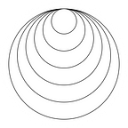
As you can see above the treatment of vector shapes are very different from previous iterations. This format allows for a visually more dynamic yet still cohesive design that is both intriguing to the eye, and fits the personality of Arvo. For the three iterations above, I played around with color, after doing the layout of the vector shapes. For all designs, I used the red tone as my spot color because it is bold, yet not too saturated that it is jarring to the eye.
The composition on the left does a great job leading the eye through the left page, then the red circle telling the viewer where to start — there exists simplicity in the layout with the light background and the single spot color.
The composition in the center takes a different approach, where the spot color is used as the background. This layout definitely stands out from the crowd, but in terms of readability and considering the comfort of the reader, I believe that the red can be very jarring.
The composition to the right is a combination of both, but more divided in the center — therefore, I believe that this composition fails to achieve harmony like the other two compositions.

In order to get a better understanding of the flow of content from left to right and its harmony, I had to print out a hard copy to see the designs in person.
Office hours Critique:
October 7, 2020
–––––
We signed up 15 minute slots to talk to Vicki about our posters. Here is what she said:
- The first vector shapes might be more representative of “Arvo.” It feels more stable and more orderly and bold — consider playing with scale, and going off the grid to create more interesting compositions
- The new vector shapes are more interesting, but it might not draw enough attention to the content on the right
- The content on the right feels very “left” and “right.” Try moving the two columns closer together, and play with scale and break the grid in order to make it more dynamic.
- Increase the scale of the “font family” and the glyph visualization.
- Overall, a good representation and exploration of Arvo, its up to me to decide which one I will run with.
What is next?
For my final piece, I am planning on sticking with the compositions from Exploration 4. Despite what Vicki said about the design, I personally think that the illustration is a better representation of Arvo, with its diagonals and shapes. It may draw the attention away from the body text, but a number of my classmates stated that it brings intrigue and curiosity to the body text upon a glance. I think the composition does a good job capturing the viewers eyes from afar, with its simple, yet holistic layout.
I did try to refine the first vector shape iteration that Vicki has mentioned during critique, but I couldn’t find a happy spot to end. Therefore, I finished the project the the poster below.

Final Poster
–––––
For my final poster, I made some simple changes to the layout and the illustration. I reduced the stroke of the illustration to create more contrast to “Arvo,” and bring more attention to the body text. I also adjusted the margins of the text to make the right side of the page more dynamic.


Final Critique
October 8, 2020
–––––
Guest Critics: Tim Madle, Kipp Madison, Carol Pickerine
Overall Critique:
- “When you start to use the text to create imagery, you should be repeating the name again because it becomes art and is not readable.”
- Grouping of information through using color, scale etc can be effective.
- Use of scale can be beneficial to the spread — provides a good complement
- Try not to just “hard return” in order to get rid of the window
- If text is being broken, try to think about the syllable and break it there for readability and understandability.
Arvo Critique:
- Carol Pickerine: “Drawn to Arvo. The rags complement the left side of the page”
- Arvo grabs the viewer’s attention from afar
- Good relationship from left to right side of the page
- Use of color leads the eye to the right content — starting from the title to the circle
- Kick the bottom paragraph under the “bold, stable, orderly” closer to the heading
- Font family and glyph information can be in grey or red (?) to make it more of a secondary element
- The geometric shape is good for “Arvo”
Reflection
October 9, 2020
–––––
On Thursday October 8, 2020, we wrapped our typeface spread after an in-class critique. Overall, I am happy with the final results. I think something that I really need to work on is breaking the rules. Throughout the project, I found myself restricting elements to the grid and margins. I rarely explored breaking the grid or having text or images bleed off the page. Of course this is my personal taste—simple composition with a simple layout—but I do think that it is important to let loose and go crazy during the early stage of the project. I find it really interesting that my approach with school projects, most of the times, end up being very conservative. In order to mitigate this, over the summer, I designed a poster every day during quarantine and it felt really good to create work with no stakes — this is something I could really work on for future projects in school.
Unlike the previous project, I definitely explored more in the beginning, creating 35 different spreads. Although it was stressful and quite difficult to choose one to run with, I think in doing this, I was more sure and confident of my final spread: I knew that my final composition was most effective because I had explored other alternatives, whereas in the previous project, I was confident in one design and explored many variations within, but in hindsight, I defnitely had thoughts that it could’ve been better.
I definitely learned a lot about composition and spread, and what truly is effective in terms of readability. I do think that the transition from the poster project before to the magazine spread was difficult for me because it was hard to think about where to put my focus. However, I was able to find a balance between creating a spread that would stand out from afar, and captures the reader’s attention enough that they would be intrigued to read more about the typeface. This was a fun project, and now the hard part — creating a typeface video!